Here's a compilation of 21 secrets and tips for designing an awesome, interactive and truly engaging website!
Whether fair or not, people will judge a company they find online based on the first few seconds of seeing that company’s website.
A well designed website can encourage first time visitors to stay, explore, engage, interact, while perhaps even having fun doing so. The positive experience ultimately influences their decisions -- whether that’s to buy your product, subscribe to your blog, or perform any desired action.
But apart from just slapping on some snazzy videos and images onto your website, there’s actually more to web design under the hood. I’ve compiled some of the most current tips, trends and secrets below to help you build an awesome and engaging website that both you and your audience will enjoy.
1. Design for your audience
Your target audience (a.k.a. your market) should be the first thing to consider when creating your website, so that you can tailor fit the design with them in mind.
Who is your target demographic? Men over forty wanting to get back in shape? Working moms looking for ways to squeeze exercise into their daily routine? Bike enthusiasts? Artists?
The more specific, the better. This helps you narrow down what type of design is most appropriate to use.
Remember the saying, if you’re trying to sell to everyone, you sell to no one.

Once you’ve identified your demographic, find out what they would typically want to see. What are they likely to expect from your website? What questions are they looking to answer or what need do they want to fill when they visit your page?
This is also the time you should zero in on the site’s purpose -- is it to sell, to educate, or to entertain? Maybe all three? Or is it something else?
If you’re a freelancer or an agency building a website for someone else, work with your client to gain clarity on what the target audience is, what the client wants to offer, and what this means in terms of the type of content they’ll need to put out there for their current and potential customers.
2. Keep it simple
New site builders can have a tendency to cram all information onto their homepage. This creates clutter and confusion. To avoid overloading your main page, prioritize the information you want to show.
If what your business is about isn’t clear from the first ten words on your home page, you probably haven’t simplified it enough.
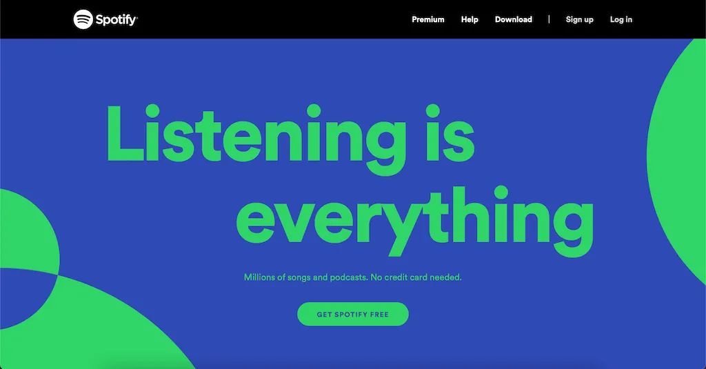
An example home page from Spotify. Really simple, with a very clear call-to-action.
Only the most important information should appear on your home page. Others can be shown in separate pages, or below the fold (that part of the page that isn’t immediately visible until you scroll down to it).
This has the added benefit of making your website load faster, resulting in a better overall user experience.
3. Make it fast
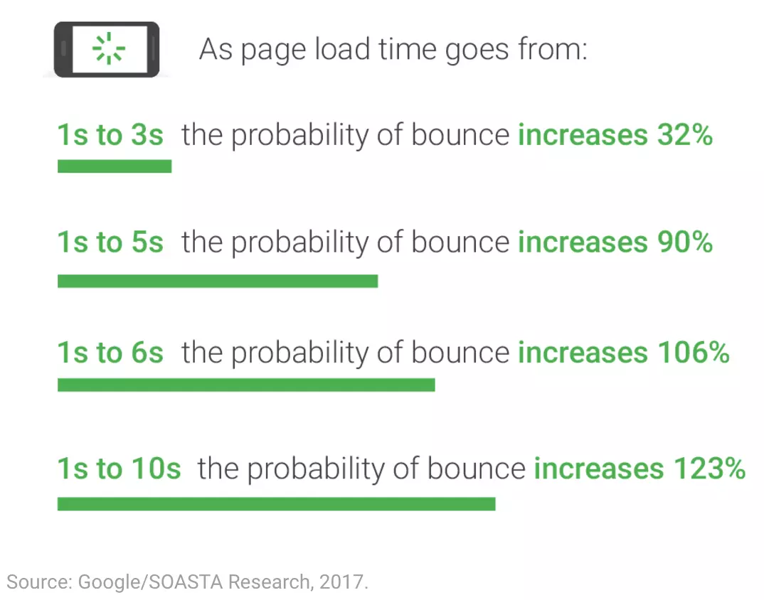
Recent stats show that
53% of mobile users leave a website if it takes more than
3 seconds to load a page.
Ironically, in the same research, Google says the average load time for mobile pages is 22 seconds. This means there’s a whole bunch of websites out there that do not meet user expectations!
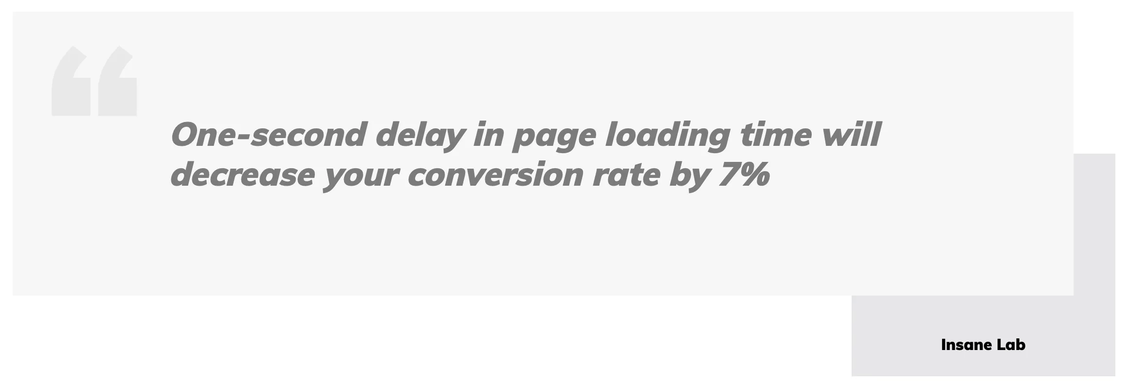
Image credit: insanelab.com
Stand out from the rest by making sure to serve up your pages lightning fast so users don’t bounce off to a competitor site.
4. Easy navigation
Your users should not have to waste time figuring out how to navigate your site in order to find the information they need.
Sticking to the usual standards, like having the navigation at the top of the page, would be your safest bet, but know that there's a recent rise on sites that use an
upside-down page approach as well.
Of course, you can also get more creative and offer alternative navigation controls, like the ones in
Species in Pieces which work quite well.
Just remember to be consistent across your entire site to avoid confusing your users.
Pro tip: You can also help users find relevant information by adding search functionality as your website grows.
5. Have a clear CTA (Call-to-Action)
Arguably, this is one of the most important elements in your website.
CTAs invite users to take the next step: whether that’s to buy your product, make a donation, sign up for a newsletter, or set up an appointment with you. They make it clear to your website visitors what you want them to do next.
Design your CTAs so that they stand out from the rest of your content and people can actually see it.
The example from Netflix below clearly shows its call-to-action, with almost nothing else on the page.
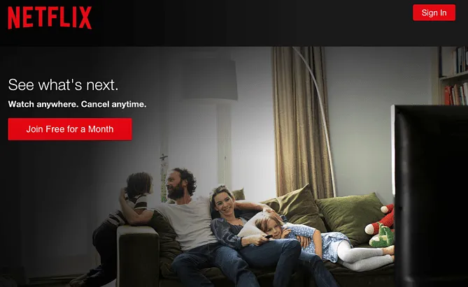
Very clear Call-to-Action from Netflix
And, you don’t have to limit yourself to one CTA per page, especially in a long-form copy or funnel. You can put CTAs before, within, and after your sales offer, to make sure that users have multiple opportunities to take up your offer.
Just don’t overdo it to the point of getting too 'salesy' and annoying.
For more great examples of CTAs, check out
this post from AdEspresso.
6. Use whitespace
Whitespace helps in creating aesthetically pleasing websites. It gives your site room to “breathe”, allowing viewers’ eyes to relax from any stress when reading.
Spaces can also serve as effective framing for your most important texts and other design elements to stand out and get noticed. This is particularly important when introducing your call to action, for example.
The same samples from Spotify and Netflix above really takes advantage of whitespace to bring focus to their CTA.
Here's another good one from Tinker Watches:
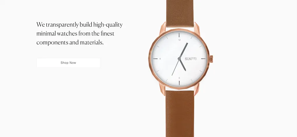
Tinker Watches used whitespace really well on their site
With a lot of space left blank, your users are more likely to “hang out” longer and explore your website more, thereby reducing your bounce rate.
Check out this post for
more inspiration on the use of white space.
7. Use colors strategically
It’s no secret that particular colors mix well with some but not with others. Also, some colors resonate with different emotions (excitement, sadness, surprise). Or they could symbolize different attributes (strength, creativity, freshness, competence, luxury).
There is an entire psychology surrounding color that would be too lengthy to cover here, but
this post and
this one by top marketer Neil Patel is a good resource for a start.
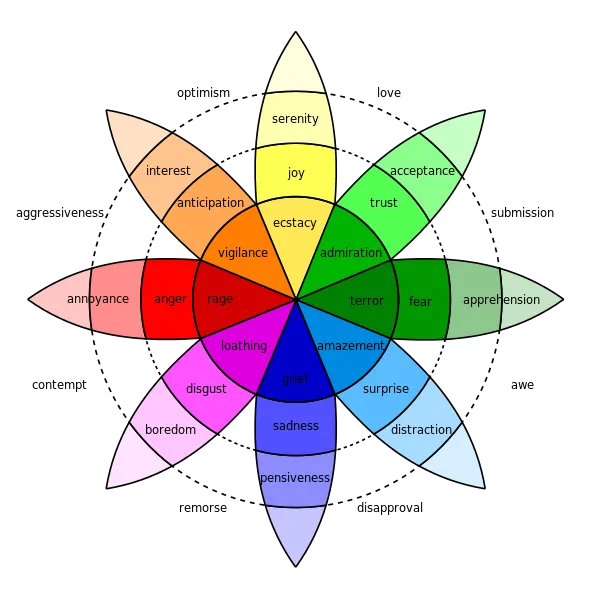
Plutchik’s Wheel of Emotions. Image source: Wikipedia
It’s important to choose a color palette that works well with the message and image that your brand wants to convey.
Once you have chosen your color palette, assign which colors to use for your buttons, headings, body text and other page elements.
8. Use clean, easy-to-read fonts
The worst thing that you can do for your site is to experiment with lots of different fonts or changing them up on every other page. That’s a sure sign to your users that you haven’t got your act together.
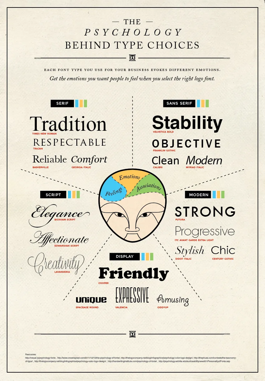
Choosing a font can be tricky as there are a few considerations to be made. Similar to color, there is a psychology behind font types that need to be considered.
This article from the Daily Egg might help you decide on which one to use for your brand.
Choose a couple of fonts that look clean and easy to read, and use it consistently throughout your site.
9. Optimize images and videos
Just like whitespace, images and videos help your users get a break from reading. But be careful not to add these elements just for the sake of adding them.
Images and videos should complement your content to help you get your point across, rather than distract your users away from your message.
A good mix of text and visuals will keep your content interesting and keep your users on your site for longer.
Keep in mind, though, that images and videos tend to take up a lot of bandwidth and may cause your site to load longer. Google recommends using next-gen formats like WebP, JPEG 2000 and JPEG XR. These new formats provide better compression than the regular JPEG and PNG formats.
I personally prefer WebP as this has the most widespread adoption in modern browsers.
10. Make it responsive
No, we’re not talking about adding a chatbox into your website, although that’s yet another engagement tip by itself.
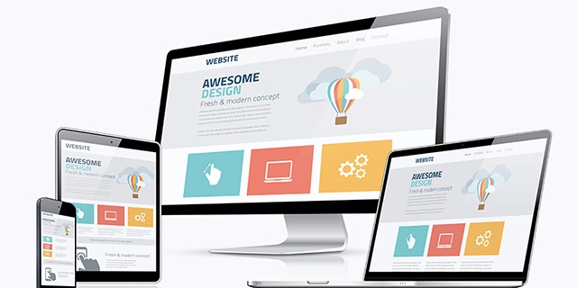
We’re talking about websites that respond and adapt to the various screens it is viewed on, whether desktop, tablet or mobile.
According to HubSpot,
mobile web traffic has consistently accounted for about
half of all global web traffic since the beginning of 2017.
This means that half the time, your site is being viewed on a mobile device of varying screen sizes. Best to make sure that your site looks as good on mobile devices as they do on a regular desktop.
Cyberchimps has a nice checklist here to test for responsive web design.
11. Keep your content focused
This ties back to #1 above. If your design elements are focused on your specific market, your content should align with that focus accordingly.
It might not be a good idea to devote an entire post on a political rant on a site dedicated to travel, for example.
Getting your content focused prevents you from flooding your page with unrelated material, which can quickly disengage your target audience.
12. Organize with section headers
When writing blog posts and other content-heavy material, break them up by adding section headers to prevent users from getting bored and leaving your site. You can also use bullets or numbered lists like I did on this page.
For your human readers, a difference in font and size may be enough to differentiate headers from regular text. But you still have to make sure to use appropriate tags on your headings so that these are recognized by automated web crawlers indexing your site.
Headers give structure to your content, and allows users to skim through your page and decide to read specific sections they find interesting.
While they may end up skipping some parts of your content, it’s way better than to have users leaving your site intimidated or bored by huge chunks of text.
13. Set the tone right
Your writing should be friendly, encouraging and conversational. As most copywriters would say, write how you talk. Like a human being talking to a friend.
Break up long paragraphs into three to four sentences at the most. This will make your content easier to read, and ultimately easier to understand.
14. Confirm critical actions
When a user clicks a buy button, subscribes to your list, or performs something in your CTA, display a confirmation screen or message to let them know that action was successful.
A simple thank you for the purchase, or a congratulations/welcome message after a visitor has subscribed to your list, should be sufficient.
15. Test regularly
Ideally before, but otherwise immediately after publishing, you should test your website to find out if there are problems.
In some of my website audits, I’ve seen too many sites that have dead links, a few links that lead you to the wrong spot, or even broken functionality.
I have even seen a legit website with links that led me to a “free iPhone” scam, which the site owner had no idea about.
So even when your site is already live, take the time to test it every now and then to ensure that there are no issues from the last time you checked.
16. Encourage feedback
Where possible, offer your visitors a chance to provide feedback about your content and about the site in general.
Blogs usually add a feedback form at the end of an article (this page has one, too), allowing readers to leave a comment.
Others simply add emoji buttons allowing readers to leave a quick reaction. This micro-interaction seems an easier hurdle to most visitors and quickly generates a lot of feedback on your blog post. And lots of feedback also boosts your SEO. Facebook has mastered this with their Like button and its many variations.
17. Add a chatbot
One study shows that
44% of US consumers want chatbots over humans for customer relations.
And according to Invesp, an estimated
67% of consumers worldwide used a chatbot for customer support in the past year and around 85% of all customer interactions will be handled without a human agent.
When set up properly, having a chatbot in your homepage can increase customer engagement due to the quick turnaround time that chatbots afford.
More and more sites are recognizing the power of chatbots for various use cases. Consider evaluating how you can use it in your business, starting with customer service.
One caveat: Make sure to set up your chatbot properly, or you'll end up disappointing your users with incorrect or irrelevant responses!
18. Make your contact details easy to find
It’s been said that it takes about eight (8) touchpoints before a cold prospect eventually becomes a customer.
Whether that touchpoint comes from an ad, an email, a website or a chat interaction, people need a few interactions before they decide to purchase something from you. A few may be on the fence simply because they have some questions they need answered before they decide.
Making sure that your prospects are able to contact you easily can make this conversion easier. It also lets them know that when they actually become your customers, they know where to reach you if they have issues with your product.
This can be accomplished by providing a
contact form, or a
phone number, or by adding links to your
social media accounts. And of course, we've already mentioned
chatbots above.
19. Add social media buttons for easy sharing
Particularly when you’re writing content that is helpful, educational or interesting, people would want to share your content in their various social media accounts.
Make it easy for them to share your content by providing quick sharing buttons linking to your audience’s most common social media accounts.

Sample social media sharing buttons
20. Add internal and external links
Links to external references and resources add authority and legitimacy to your material. Add links to them whenever possible. Not only does it help your audience, it helps with your SEO rankings, too!
Also, if you have related material within your website, add links to those articles and posts as well, so that your audience can quickly access them if they need to know more.
21. Don’t forget security!
Ah, security... Most newly-minted websites miss this part. For most website builders, once they publish the site for their clients, their job is done.
Did you know that
43% of cyber attacks target small businesses? So, if you think you’re exempt from any cyberattack, think again.
It’s important consider security right from the get-go to ensure your new website doesn’t end up defaced or your data taken by unscrupulous hackers.
For starters, there are a number of free online website scanners such as
SecurityHeaders.io,
Sucuri,
Qualys,
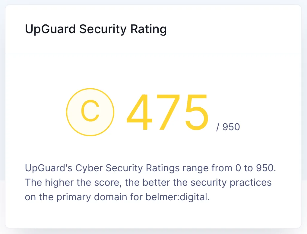
UpGuard and
Observatory that can perform an external assessment of your website, provide an overall security rating, along with recommendations on how to fix any weaknesses they find.

Sample result from SecurityHeaders.io

Sample result from Sucuri
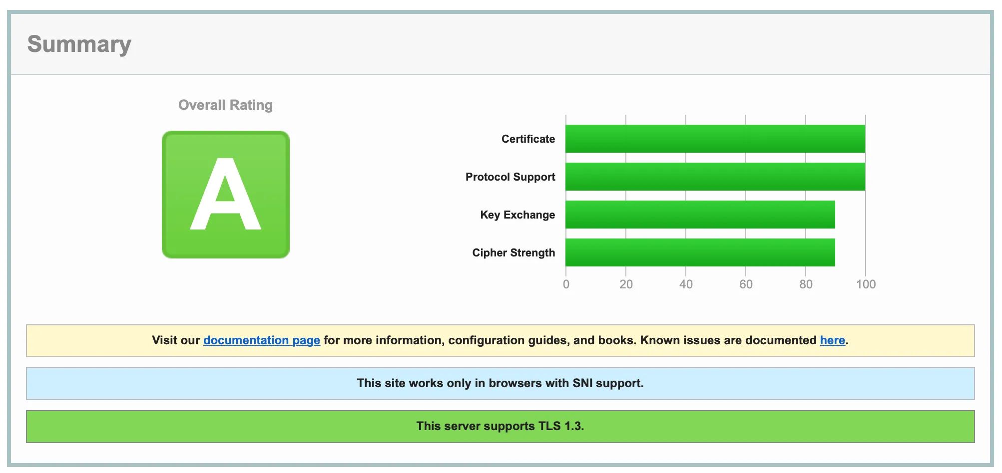
Sample result from Qualys
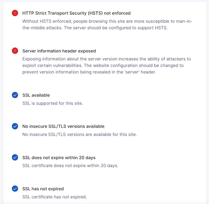
Sample result and recommendations from UpGuard
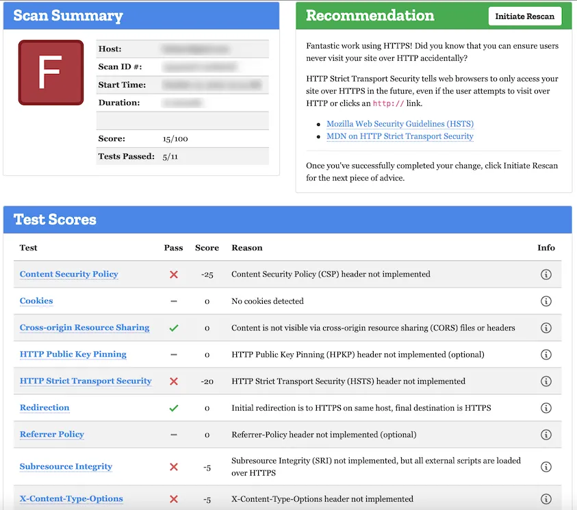
Sample result and recommendations from Observatory
As you can see, different tools yield different results. Each tool focuses on different weaknesses, so it's a good idea to use several of them to get a fuller assessment.
But be aware that these tools can only scan externally. They cannot detect internal vulnerabilities. For a deeper scan, you may have to contact a provider to perform a paid Vulnerability Assessment Scan for you.
Although these measures might mean a little more upfront investment, it can save you from a lot of headaches and reputational trouble down the line.
Conclusion
Building a website may seem like an easy enough task at the outset. But if you want to build one that truly captures your audience, you’ll need more than static text and a few design elements to jazz it up. You'll want to to make it interactive, functional and engaging.
Anticipate what your audience needs. Provide clear messaging about your products and services. And build a smooth & secure way to access them. These steps will make your website not just a simple homepage for your brand, but also an experience that users will keep coming back to every now and then.
Need help designing and building a website for your new brand?
Or perhaps a redesign to keep it fresh and current? Talk to us.What do you think of these tips? Are there any good ones you think we may have missed? Let us know in the comments!











Thanks for the marvelous posting! I genuinely enjoyed
reading it, you may be a great author. I will be sure to bookmark your blog and will eventually come
back sometime soon. I want to encourage you to
definitely continue your great job, have a nice morning!
Glad you enjoyed it. Thanks for stopping by!
Hey I know this is off topic but I was wondering if you knew of any widgets I could add to my blog that automatically tweet my newest twitter updates. I've been looking for a plug-in like this for quite some time and was hoping maybe you would have some experience with something like this. Please let me know if you run into anything. I truly enjoy reading your blog and I look forward to your new updates.
Hi Isabella. Thanks for the feedback!
I had a similar requirement recently, but for Facebook instead of twitter. Two of my go-to options are:
(1) create a social widget using taggbox.com -- they have a free option limited to two social media sources, and twitter is among the sources you can grab from -- and embed that widget into your blog site. Be aware there's a small taggbox branding that will appear on your feed, unless you upgrade to their monthly subscription. Alternatively,
(2) use the Flow-Flow plugin, it's free and quite customizable.
I haven't used either of them for twitter but I believe they should work just as well as they did for Facebook for one of my clients.
Good luck!
I think this is among the most vital information for me. And i'm glad reading your article. But want to remark on some general things, The website style is great, the articles is really great : D. Good job, cheers
Hi Wiley, I'm glad you found it useful! Cheers, Elmer